Component Settings
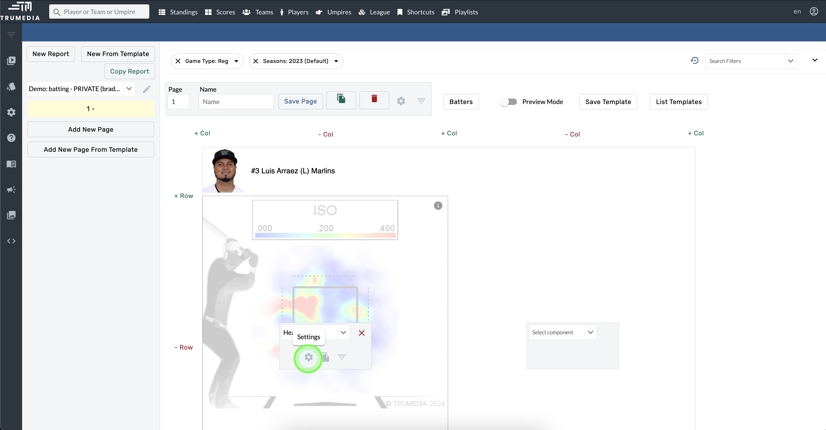
Hover over a component and tap the gear icon to get started
Common Settings
Hover over a component.
Open Component Settings.
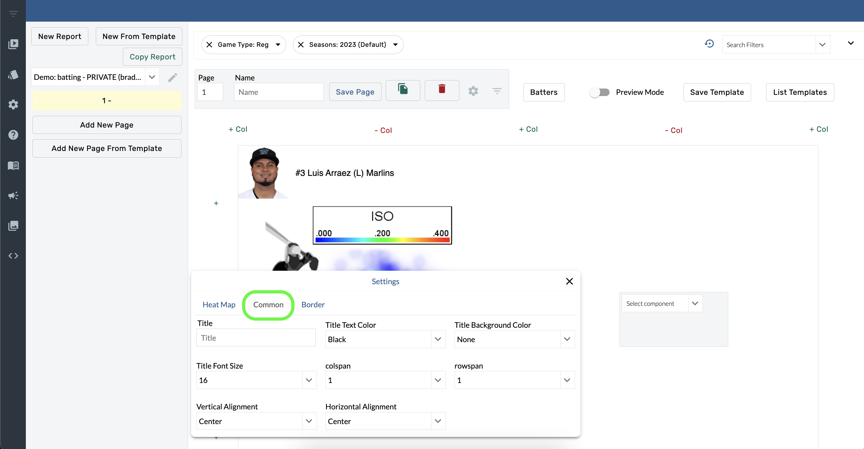
Select Common.
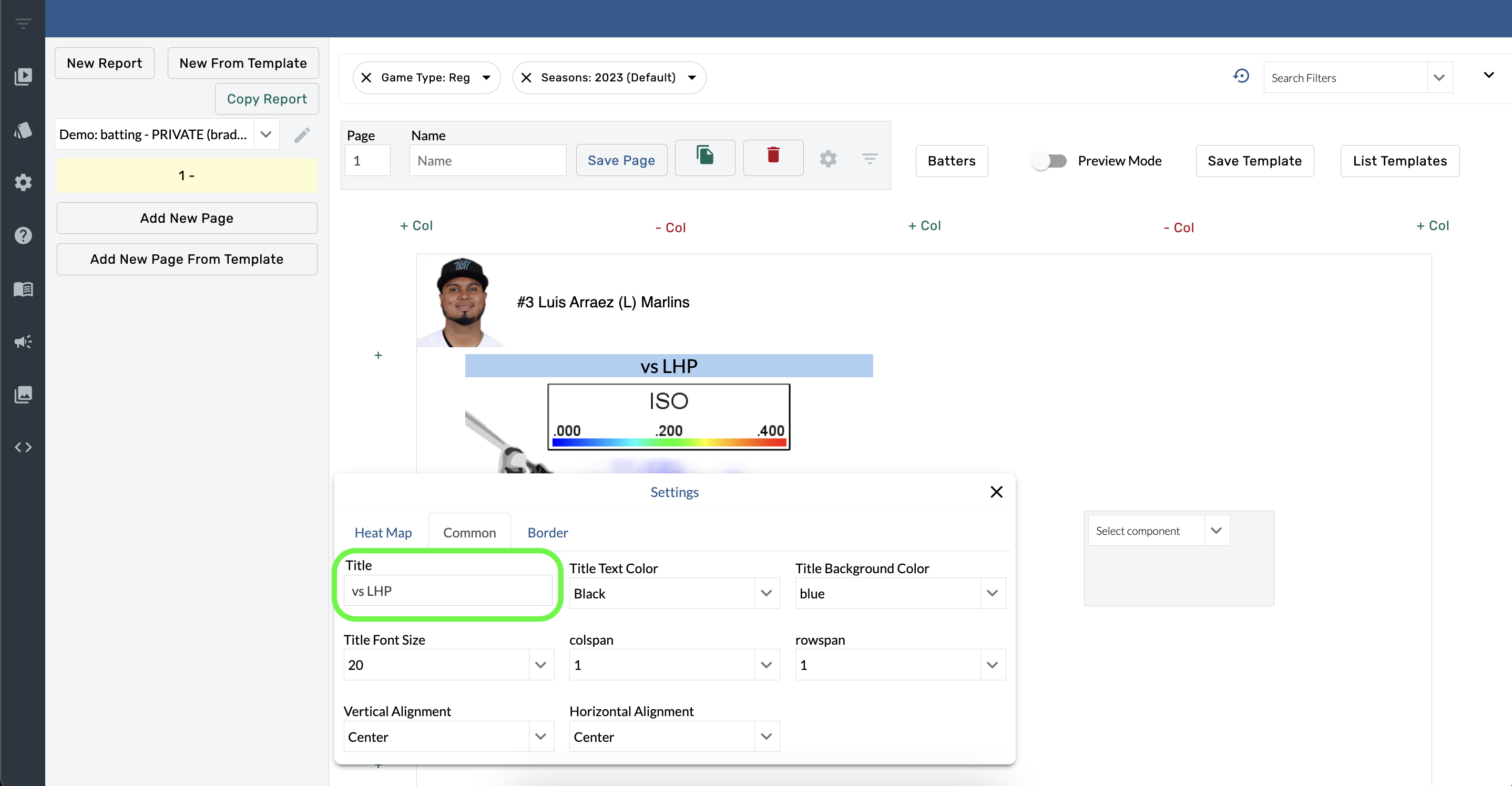
Title
Hover over a component.
Open Component Settings.
Type into the Title box.
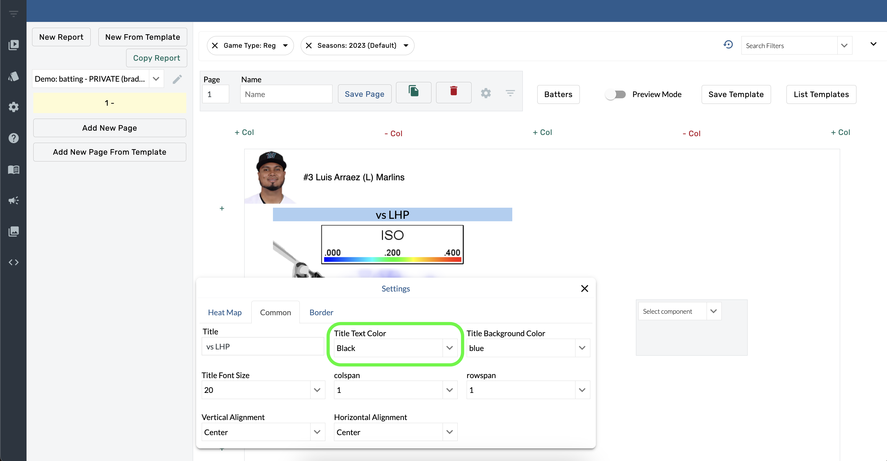
Title Text Color
Hover over a component.
Open Component Settings.
Select a color from the Title Text Color menu.
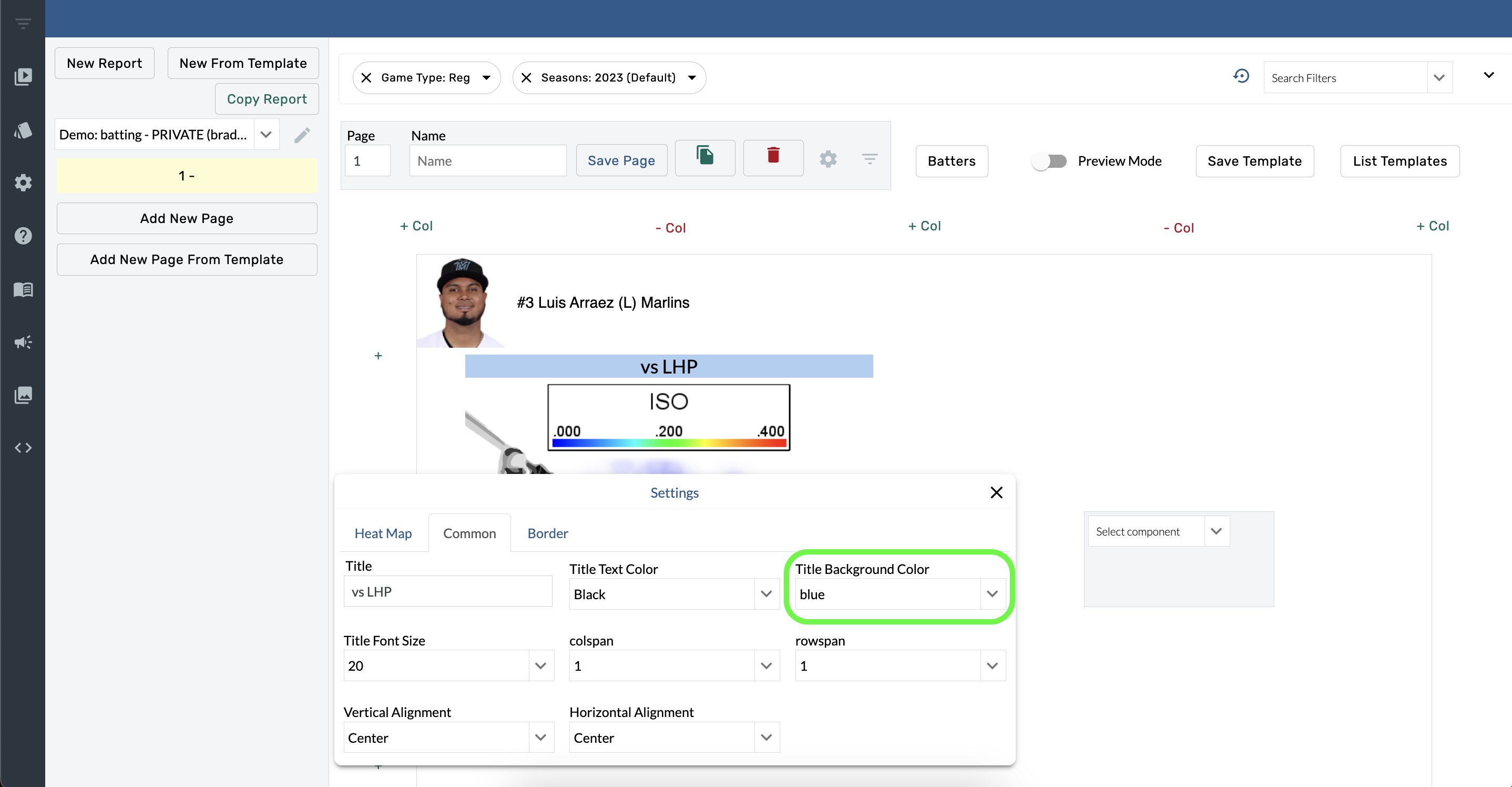
Title Background color
Hover over a component
Open Component Settings.
Select a color from the Title Background Color menu.
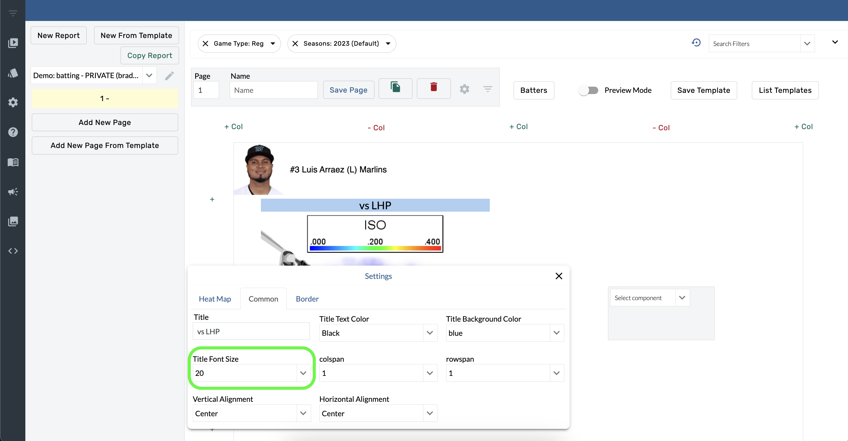
Title Font Size
Hover over a component
Open Component Settings.
Select an option from the Title Font Size menu.
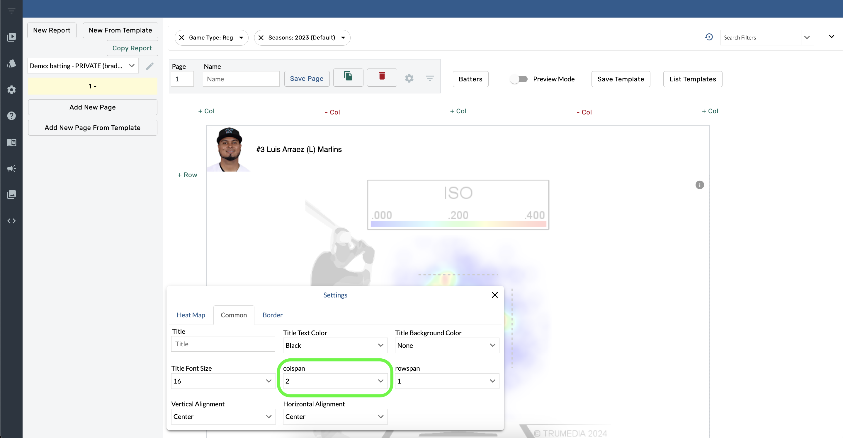
Colspan
Hover over a component.
Open Component Settings.
Select an option from the Colspan menu.
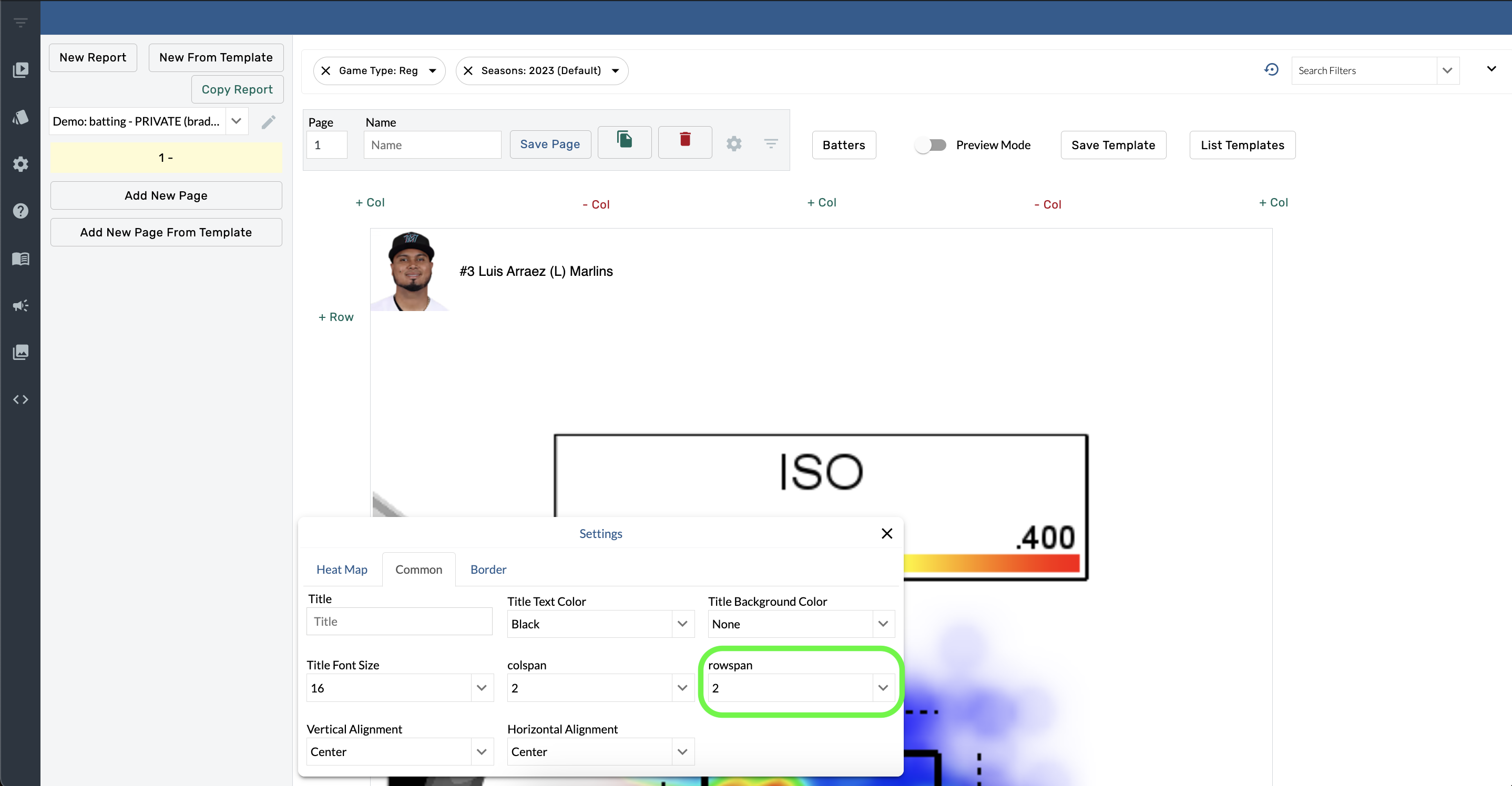
Rowspan
Hover over a component
Select Component Settings.
Open the Rowspan menu and choose an option.
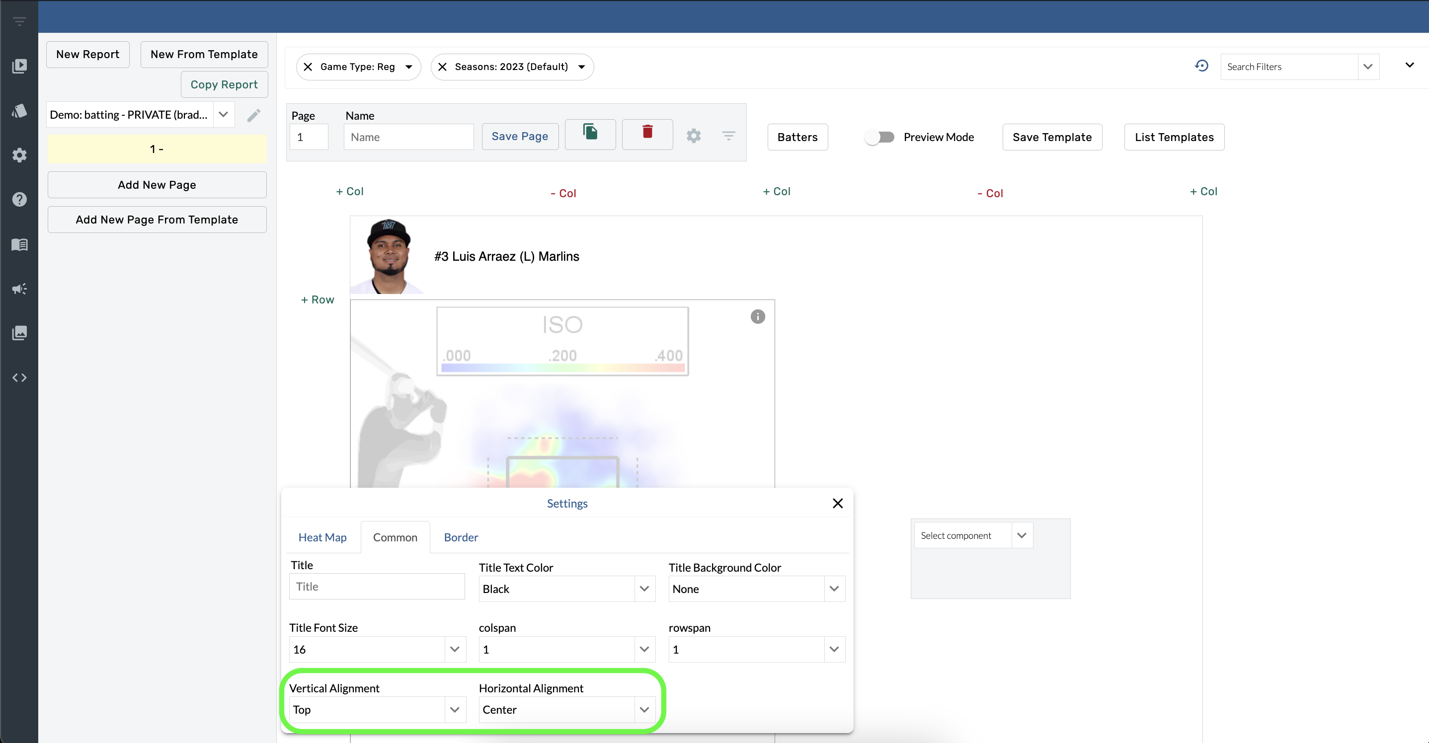
Alignment
Hover over a component.
Select Component Settings.
Open the Vertical Alignment menu and choose an option.
Open the Horizontal Alignment menu and choose an option.
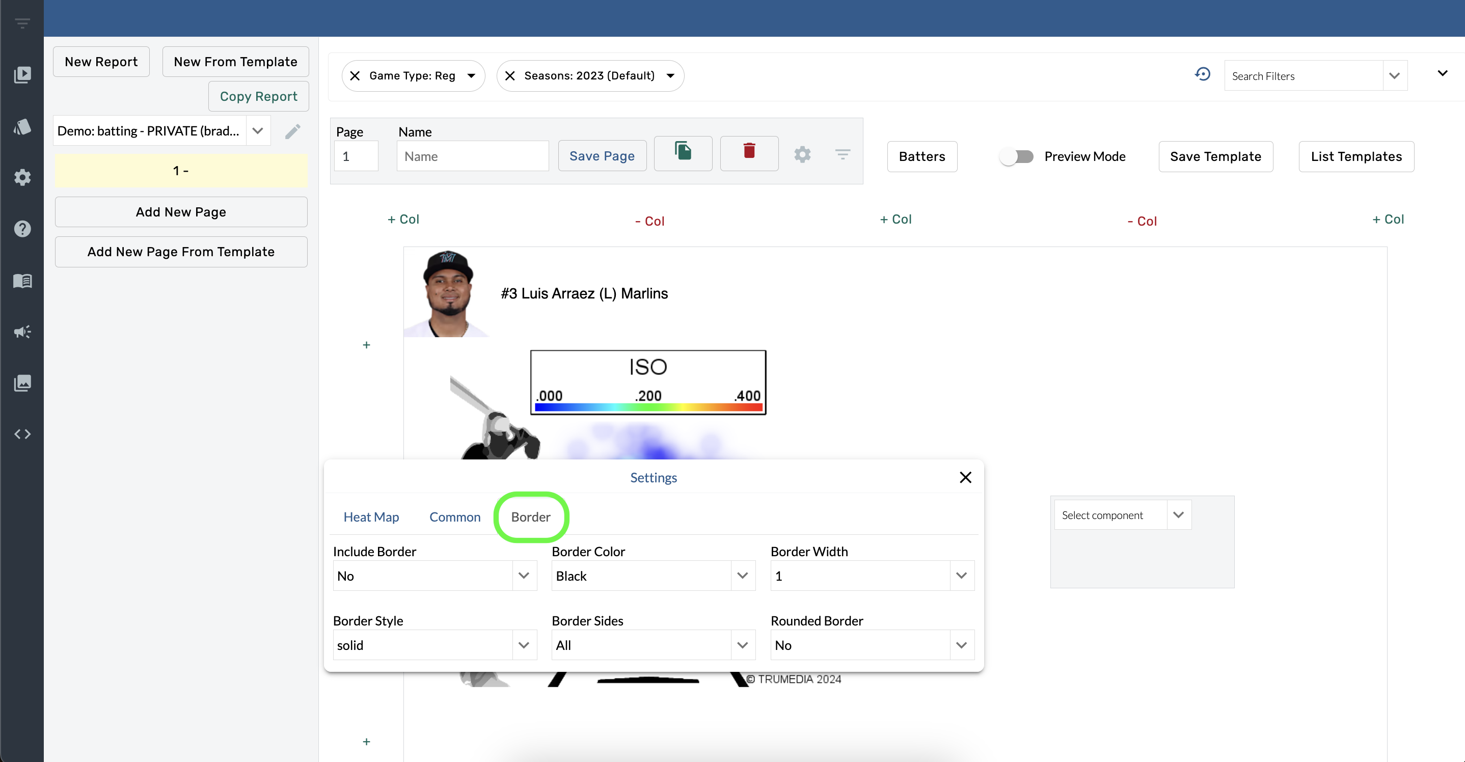
Border Settings
Hover over a component.
Select Component Settings.
Open the Include Border menu and choose Yes.
Open the Border Side menu and choose an option.
Adjust the color, width, and style of the border with the other options in the Borders.
Español
Haga clic en el título para ver la página traducida.
