Histogram
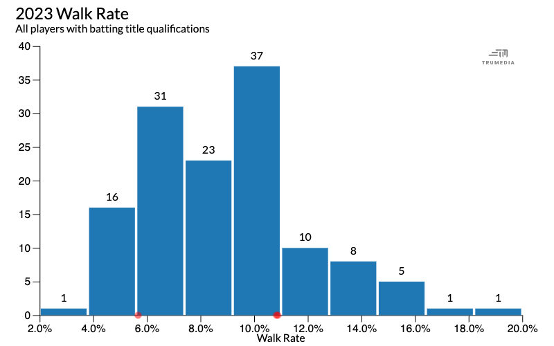
A histogram shows the frequency distribution of a stat. This example shows MLB walk rate for all hitters with batting title qualifications in 2023.
The tallest bar in the middle of the chart represents 37 players that had a walk rate between 9% and 11%. On the right side, we see the shortest bars on the chart. This represents the two players in the league with the highest walk rates. On the left, is the one short bar that represents the one player with a walk rate below 4%.
Hover over a bar to see the players represented in that bucket and their exact values.

Create a new histogram
Select a sort by stat on the data table
Open the Graphics menu
Select Histogram.
Add a stat
Scroll down to the data table below the chart.
Tap the plot stat button next to the stat name.
Change the bin count
Open the bin count menu.
Choose a new bin count.
Highlight a team or player
Scroll down to the data table below the chart.
Pin a team or player on the leaderboard.
Pinned team/players display as dots on the chart and there is a Show Pinned Data as Bars option.
Add titles
Type in the text boxes to title and label the chart.
