Charts
Scatter Chart
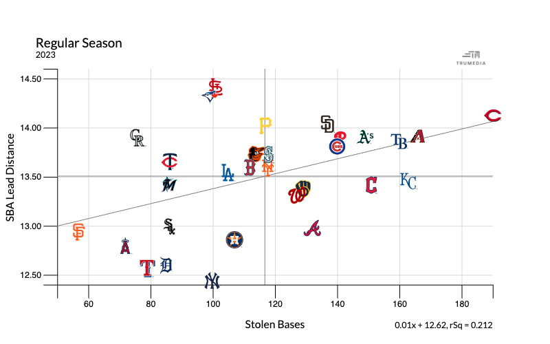
A scatter chart shows the relationship between two stats. In the example below we have stolen bases on the horizontal x-axis and lead distance on the vertical y-axis.
The Cincinnati Reds stand out in the top right. They took the large leads and had the most stolen bases in the league. At the top in the middle of the chart are the Cardinals and Blue Jays, who took aggressive leads but have about half as many stolen bases.
At the bottom are the Tigers, Yankees and Rangers, whose average lead on a stolen base attempt were the shortest in the league. At the far left of the chart is San Francisco with the fewest steals.
Histogram
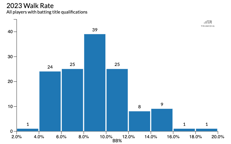
A histogram shows the frequency distribution of a stat. This example shows MLB walk rate and the tallest bar in the middle of the chart represents 39 players have a walk rate between 8% and 10%.
On the right side, we see the two shortest bars on the chart. These represents the two players in the league with a walk rate over 17%. On the left, there is one player with a walk rate under 4%.
Hover over a bar to see the teams and stats represented in that bucket and their exact values.
Time Series Chart
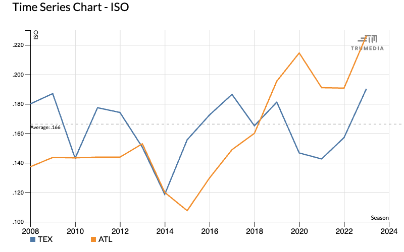
A time series chart shows trends in the data over time. The example below shows team ISO by season for the Texas Rangers and Atlanta Braves from 2008 to 2023.
Swarm Chart
A swarm chart visualizes the distribution of multiple stats and, by hovering over a dot, you can see the value of an individual data point. This chart plots all metrics on a chosen report or one metric at a time. Each point on the chart represents a team’s performance in that metric and the black line in the middle displays the league average.
The dots at the top of a chart represent the best performance in that metric and the dots at the bottom are the worst performers.

Bar Chart
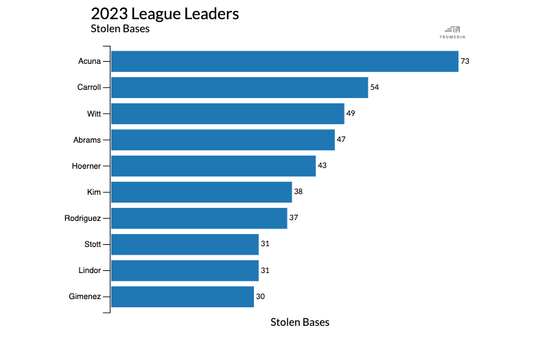
A bar chart is used to compare performance for one stat; the size of the bar on the chart corresponds to the number value. The example below shows total stolen bases for the top ten players in MLB in 2023.
The league leader was Ronald Acuña with 73 stolen; this is represented by the largest blue bar at the top of the chart. At the bottom of the chart is the Andres Gimenez with 30 stolen bases. His bar is smaller.
Stacked Bar Chart
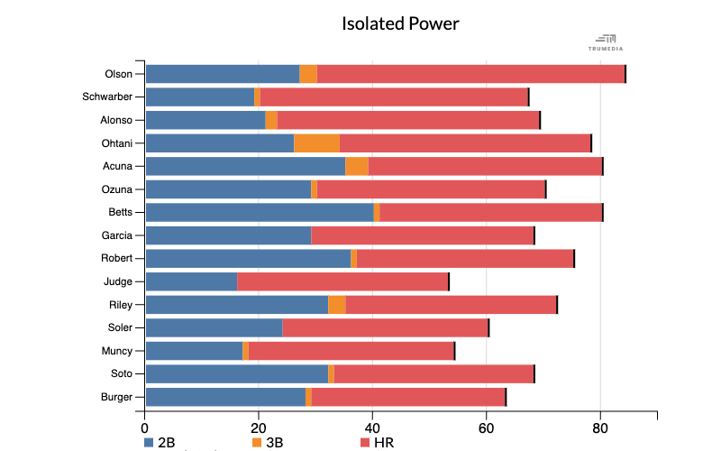
A stacked bar chart visualizes more than one stat on a single chart. This example shows the top 10 players in home runs this season, which is represent by the red bars on the chart. Stacked on top of each blue bar is an orange one that represents triples and and blue that represents doubles.
Español
Haga clic en el título para ver la página traducida.
