Scatter Chart
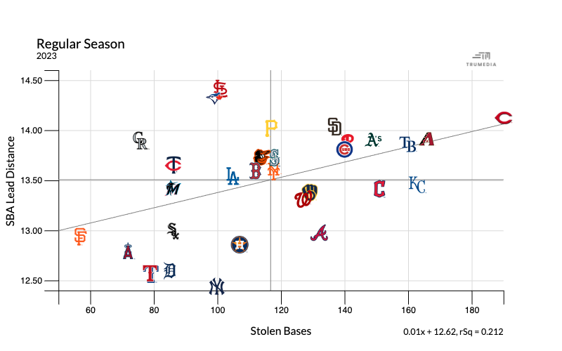
A scatter chart shows the relationship between two stats. In the example below we have lead distance on stolen base attempts on the horizontal x-axis and total stolen bases on the vertical y-axis.
The Cincinnati Reds stand out in the top right. They took the largest leads and had the most stolen bases in the league. At the top in the middle of the chart are the Cardinals and Blue Jays, who took aggressive leads but have about half as many stolen bases.
At the bottom are the Tigers,Yankees and Rangers, whose average lead on a stolen base attempt was the shortest in the league. At the left of the chart is San Francisco, with the fewest steals.

Create a Scatter Chart
Open the Graphics menu
Select Scatter Chart.
Add and remove stats
Scroll down to the data table.
Select the plot stat button next to the stat name.
Clear a stat from an axis by clicking the X next to the stat name, to the top left of the chart.
The first stat you select will go on the X axis and the second on the Y axis.
Show Images
Tap the Show Images option to hide or show the team logos or player headshots.
Images are not available when more than 200 data points are displayed.
League average
Tap the Show Averages option.
Trendline
Tap the Show Trendline option.
Add titles
Type in the four text boxes to title and label the chart.
