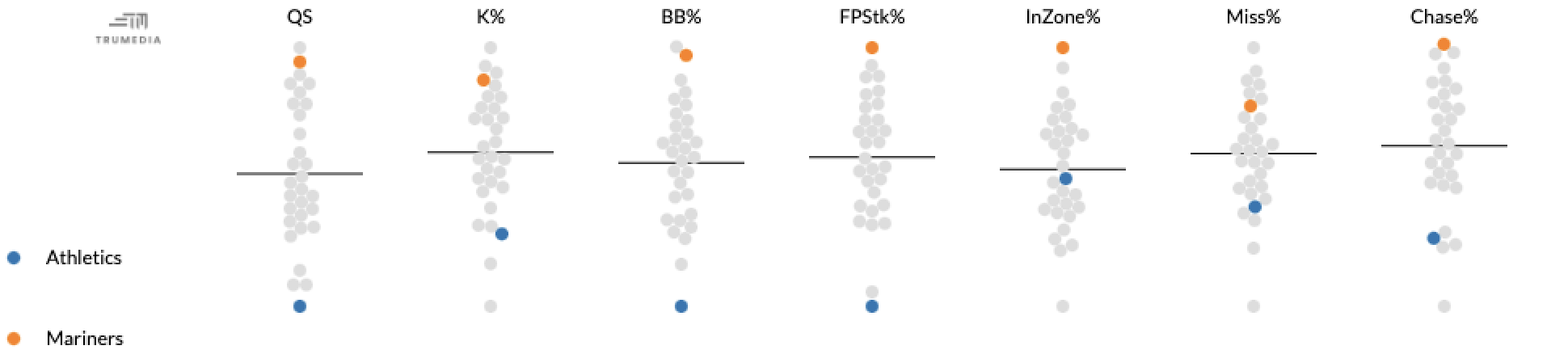
A swarm chart visualizes the distribution of multiple stats, and by hovering over a dot, we can see the value of an individual data point.
This tool can plot either all metrics on a chosen report or one metric at a time. Each point on the chart represents a team’s performance in that metric so far in the season, and the black line in the middle displays the league average.
The dots at the top of a chart represent the best performance in that metric and the dots at the bottom are the worst performers.
Create a Swarm Chart
-
Open the Graphics menu
-
Tap Swarm Chart.
Make a Custom Report with the stats to change the stats displayed
Highlight a team or player
-
Scroll down to the data table below the chart.
-
Pin teams or players on the leaderboard.